Todos
← Back to Squawk list

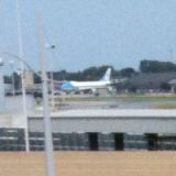


American and US Airways Employees Have Spoken: The Flag Tail Stays
On Thursday, American announced that the employees have spoken, and the new flag tail is here to stay. “It was very close but the majority has spoken and the new flag tail will proudly represent American Airlines – and all of us – for years to come.” (airchive.com) Más...Sort type: [Top] [Newest]
What I don't understand, as a graphic designer, is why they designed a tail-like logo (sits to the left of the wordmark "American" on the fuselage in the story's photo), but then didn't use THAT on the tail. I can see that the beak of the white "eagle" that breaks up the blue on top from the red on bottom would overhang (and they'd have to adjust for that when applying the design to the tail), but to me, that feels A LOT better than the disjointed, multiple gradient lines of the "flag" logo they chose.
Without the flag on the tail I think it looks like the airplane lost its shorts on the takeoff roll. With the colors they have, with the eagle graphic on the tail it would look really bland -- like when you see a secondhand garbage truck with previous operator's decals removed yet still visible.
If they're just going to put a logo on the vertical stabilizer I think they'd have to either paint it that red or blue color and have the gray featured in the logo, and that wouldn't work with that eagle graphic, and at a glance it would look a lot like US which wouldn't help with trying to create a new identity. To make it work they'd have to go with a whiter fuselage, darker text, and a bolder red and blue -- and white body, blue or red dominated tail would blend right in with half of the world's airlines. I'm sure they toyed with those ideas but went with what we see now because it doesn't look like anybody else's livery.
If they're just going to put a logo on the vertical stabilizer I think they'd have to either paint it that red or blue color and have the gray featured in the logo, and that wouldn't work with that eagle graphic, and at a glance it would look a lot like US which wouldn't help with trying to create a new identity. To make it work they'd have to go with a whiter fuselage, darker text, and a bolder red and blue -- and white body, blue or red dominated tail would blend right in with half of the world's airlines. I'm sure they toyed with those ideas but went with what we see now because it doesn't look like anybody else's livery.
While I agree with your design expertise, graphic design is based on the artist. You might me taught to follow curriculum, but artists vary, and critics vary.
Do you people really think that the airlines give a damn about what the public thinks about their paint schemes???
You're getting worked up for nothing. They could paint the thing Bahamian pink or prostitute purple. The service and operation will still be the same.
I would rather get a good meal and drink on the house, combined with on time good service, than worry about if the paint scheme looks like a Greyhound bus...
and to boot, do you really think they would have repainted if the vote had gone the other way. It had no chance of losing to begin with. As one said above, it was just a feel good gesture.
Well no good meals and free drinks after spending millions on a new paint scheme...