Todos
← Back to Squawk list


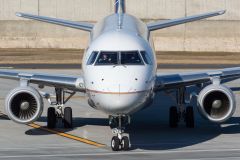

American Airlines takes delivery of its first Boeing 787 Dreamliner
American Airlines took delivery Thursday of its first Boeing 787 Dreamliner at Boeing’s Everett, Wash., factory. On Friday, American brings it home to North Texas. The airplane, N800AN, is scheduled to leave Paine Field at 10 a.m. and arrive at Dallas/Fort Worth International Airport at 4:21 p.m.. It’ll be parked at an American hangar there. “Once the plane arrives, the Tech Ops team at our DWH maintenance base at DFW will begin the acceptance process and prepare the airplane for flight training… (aviationblog.dallasnews.com) Más...Sort type: [Top] [Newest]
New livery reminds me of the old US Army Air Corps tail. But I still don't like it on AA planes! https://s-media-cache-ak0.pinimg.com/236x/31/12/23/311223e1922ee92c47cedec0eadc23d5.jpg
That has possibilities... The tail scheme and how it drops into the fuselage line is disruptive to the eye... Just the eagle would be a great improvement as that tail does not send thea message 'this airplane belongs to American Airlines'... Just a dull gray with red, blue and white is all I see... How many millions did they spend on coming up with that... z
I agree. The older livery was more interesting(and I think more patriotic).
Right, but remember, they needed to create just the right brand image for today's modern consumers. People don't have time to analyze a logo, they want something simple and comfortable so they don't have to think.
For example, the logo isn't an American Airlines logo, it's the Flight Symbol (http://youtu.be/J-KD0PdI1Ek?t=1m22s).It's red white and blue, because people know that those colors are American colors! I just drank an entire bottle of vodka before typing this!
Getting serious for a second. Stuff like this is why I hate most of the people in my generation (millenials). Futurebrand, the company that designed the logo, is (based on what I've heard from some some people I know) chock full of "young talent" i.e. dumb millenials. It really hates me that the defining characteristic of my generation is that we have so many more tools for self expression than any previous generation, more ways to spread those ideas than ever before, yet we use all that to come up with milquetoast garbage.
I am all for modern design, but imho any aircraft scheme should represent the company and/or country... When you look at Virgin Atlantic and British Airways, you know they are British... When you see Alaska and Hawaiian, you know who they are... Delta has the widget right on their tail... When I see American, it might as well be any carrier and/or country that has red, white and blue... It just says 'nothing'... And it says 'nothing' in an awful tone of grey... Oh wait a minute, it screams Aeroflot old and new... Not th eimage I would want...
Link to the delivery flight of American's first 787-8 (N800AN-8AA) on FlightAware.
http://flightaware.com/live/flight/N800AN
http://flightaware.com/live/flight/N800AN
...and they immediately ruin it with that boring livery.